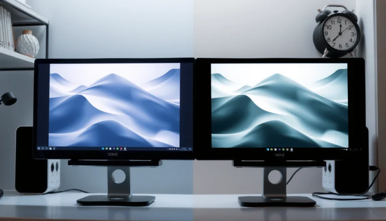
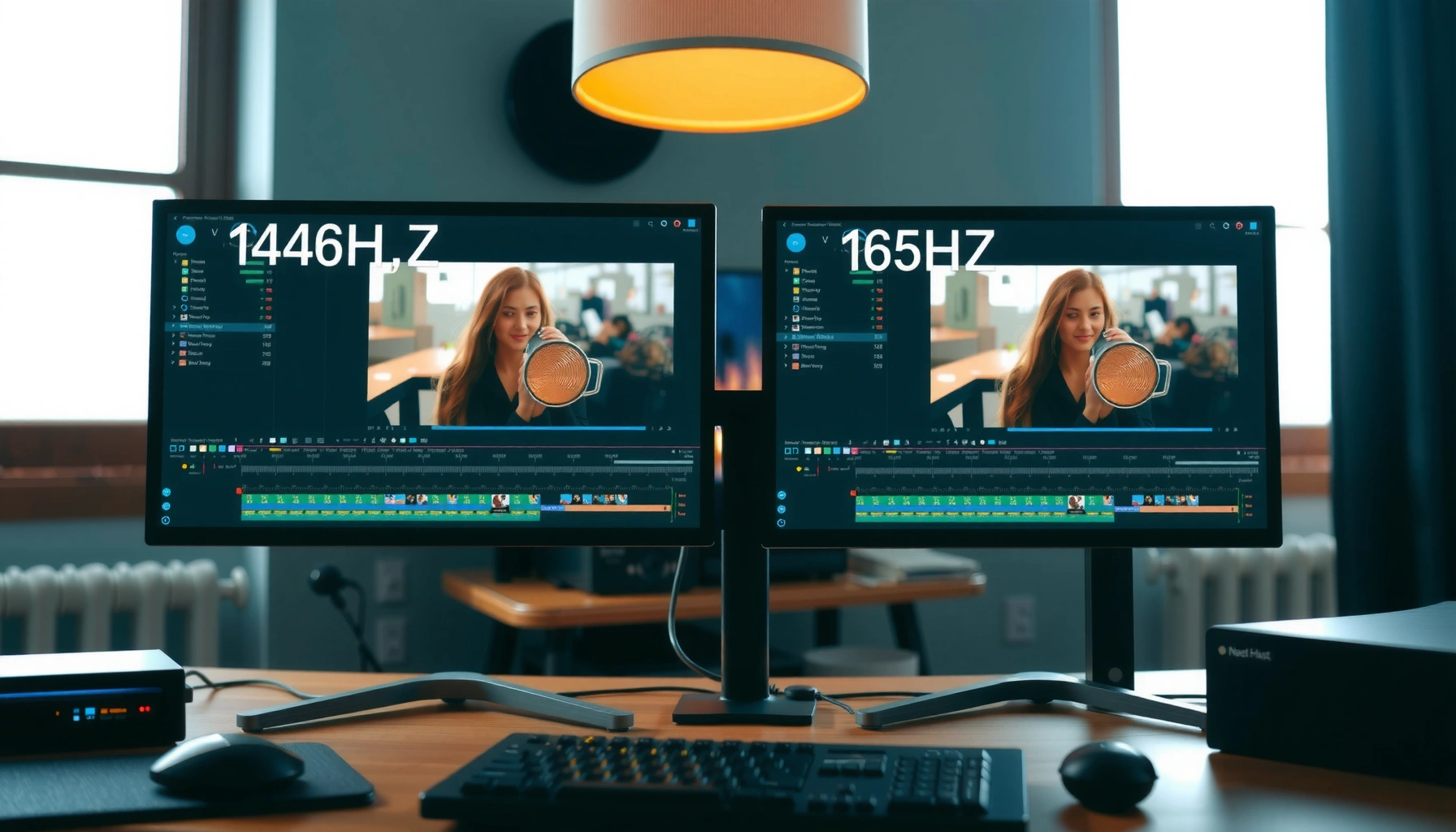

If you’re deciding between 144Hz and 165Hz for photo editing, the higher refresh rate only helps when your workflow involves fast on-screen movement—otherwise the difference is mostly invisible. This article delivers a clear verdict on when 165Hz genuinely improves editing comfort and precision and when 144Hz is the smarter, cost-effective buy. You’ll leave knowing which refresh rate you should choose for your exact photo editing style, not just for gaming.




If you’re doing photo editing, 165Hz usually won’t improve the final image quality versus 144Hz. The real difference is whether your editing workflow feels slightly more responsive—mainly smoother cursor movement and less perceived UI latency—while your exported colors, sharpness, and noise stay essentially governed by your camera files and editing settings.
If your work is mostly stills in Photoshop, Lightroom, or Capture One, the smarter upgrade target is usually panel quality and color calibration—not the last ~21 extra hertz. If you also scrub video timelines or do other motion-heavy tasks, 165Hz can feel more comfortable day to day.
Who This Is For (and When It Actually Matters)
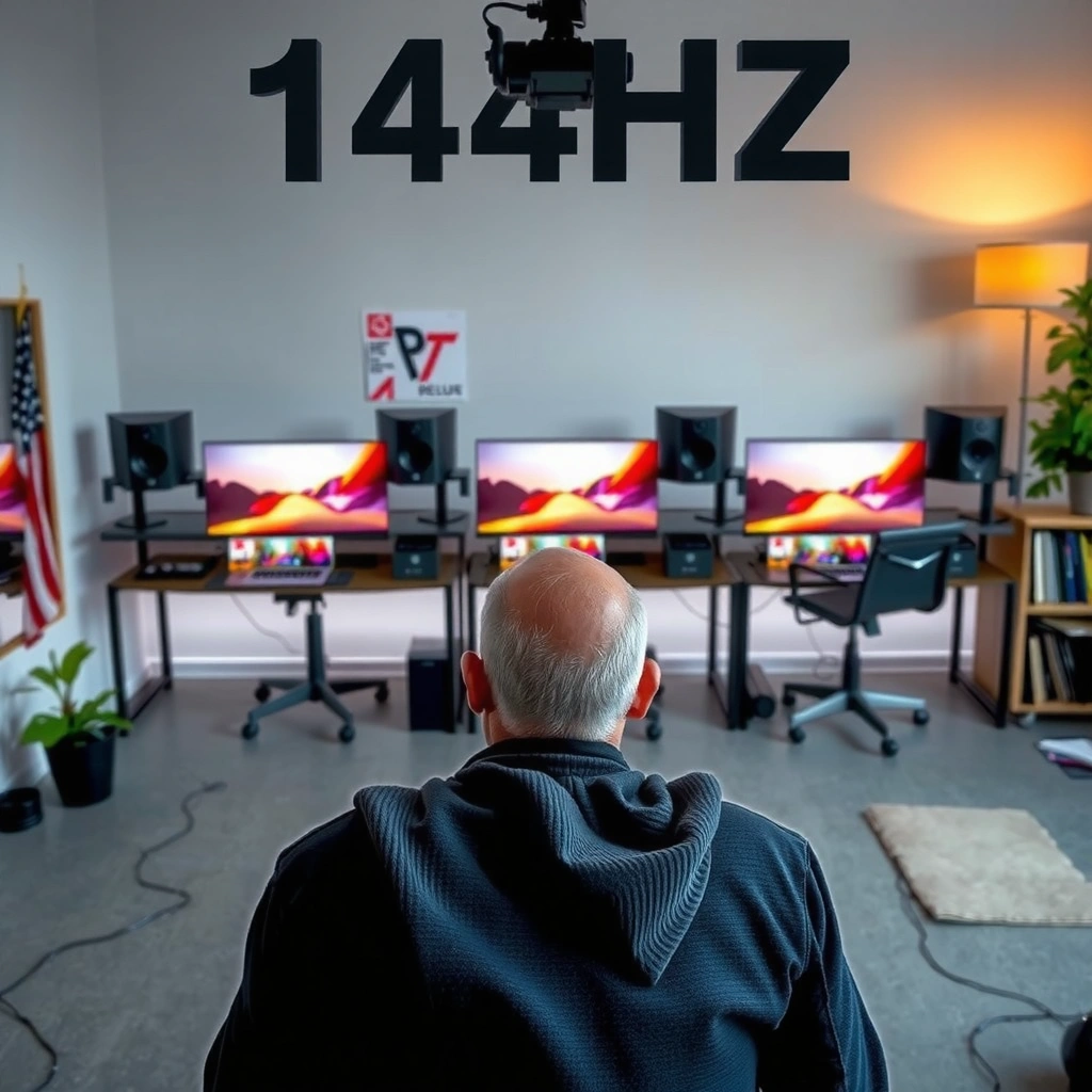
This comparison is for photographers and editors choosing between two similar monitors—often with the same resolution and panel class—where the only obvious difference is refresh rate. It’s also for people who mix photo editing with light video work, UI-heavy workflows, or fast navigation in editing software and browser tabs.
In 2024–2026, refresh-rate marketing has gotten louder, but most “creative output” improvements still come from calibration, correct exposure/white balance, noise reduction strategy, lens/profile handling, and export settings—not from changing how quickly your display cycles frames.
165Hz reduces the theoretical frame interval from 6.94ms (at 144Hz) to 6.06ms (at 165Hz), which can make cursor and viewport motion feel slightly tighter.
Display refresh rate primarily affects on-screen motion smoothness and perceived latency, not the color accuracy of your saved JPEG/TIFF/PSD files.
Adobe Photoshop, Lightroom Classic, and Capture One still depend on panel calibration and color management for trustworthy output, regardless of whether the monitor runs at 144Hz or 165Hz.
What 144Hz vs 165Hz Changes in Photo Editing
In practice, 165Hz doesn’t make your exported photos sharper or more accurate; it mostly changes how motion inside your editing software feels. Here’s why: refresh rate influences how frequently the display updates the image on screen, but it doesn’t alter the pixel data in your image files.
Final output quality: refresh rate isn’t a “creative quality” feature
The photo you export is produced by your editing pipeline (raw demosaicing, tone mapping, sharpening/noise reduction, masking, color space transforms, and export encoding). Those steps are governed by the software and your adjustments, not by whether the monitor can refresh at 144Hz or 165Hz.
Bottom line: If two monitors are equally good in color, uniformity, and calibration, your *actual* output should match closely—assuming you’re using the same editing settings and a consistent color-managed workflow.
Perceived smoothness: the main benefit you may notice
Where 165Hz can help is subjective interaction quality:
– cursor movement can look a bit smoother
– panning/zooming and transform operations can feel less “chunky”
– timeline scrubbing (if your workflow includes video) can feel less distracting
That matters most when you do a lot of fine placement—mask edges, brush strokes at high zoom, repeated transform operations, or quick viewport navigation.
Simple math for context:
– 144Hz → 1 / 144 = 6.94ms per refresh
– 165Hz → 1 / 165 = 6.06ms per refresh
That ~0.88ms delta is small, but enough for some people to perceive motion differences—especially in fast cursor movement.
According to common display timing principles, higher refresh rates reduce the time between screen updates (frame interval), which can reduce perceived latency for UI motion.
Quick comparison table: what changes vs what doesn’t
| Photo-editing aspect | 144Hz vs 165Hz impact | What actually drives quality |
|---|---|---|
| Exported color accuracy | Usually none | Calibration, ICC profiles, color-managed workflow |
| Exported sharpness | Usually none | Lens/optical sharpness, sharpening tools/settings |
| Exported noise level | Usually none | Denoise method, ISO, exposure, raw file quality |
| On-screen cursor smoothness | Small-to-moderate | Refresh rate (and also OS compositor settings) |
| Viewport motion feel (pan/zoom) | Small-to-moderate | Refresh rate + software GPU acceleration behavior |
| Perceived responsiveness when masking | Small-to-moderate | Refresh rate + how your system renders UI |
When the Extra Hertz Actually Matters
You should prioritize 165Hz only if your workflow is sensitive to UI motion smoothness and you spend enough time interacting with moving elements. If your biggest pain points are color, brightness uniformity, or scaling clarity, the refresh-rate jump won’t solve those issues.
You’re sensitive to UI motion
Some editors notice “stutter” more readily than others—especially at the edges of their vision while panning, zooming, or hovering over complex panels (histograms, curves, layer masks). If 144Hz already feels good on your current display, the jump to 165Hz may be subtle.
If your desktop feels smooth at 144Hz but becomes distracting when it drops (frame-rate dips or stutter), a higher refresh rate can make those motion artifacts less noticeable.
Your work includes motion-heavy tasks
If you scrub video timelines, review animations, or edit clips inside your photo pipeline, 165Hz can reduce visual friction. The biggest comfort wins come from repeatedly moving between frames and interacting with playback controls.
This matters even if you’re not “gaming”—editing apps still benefit from consistent, high UI update rates.
Smoother motion often requires not only a high-refresh monitor, but also a system that can keep UI rendering at a stable rate.
Your PC can drive the UI at high refresh consistently
A key constraint: the monitor can be capable of 165Hz, but your computer may not sustain a high and stable UI refresh due to power settings, GPU load, browser tabs, background apps, or software rendering paths.
If the app caps rendering (for example, due to VSync-like behavior, GPU acceleration differences, or internal frame limiting), you may not fully realize the monitor’s potential.
Even with a 165Hz panel, the real-world benefit depends on OS and application rendering behavior and whether the display link is configured to enable the rated refresh.
What to Prioritize More Than 144Hz/165Hz
If your goal is better photo results, you should treat refresh rate as a secondary factor. The highest ROI usually comes from accurate color display, reliable calibration, and a panel that’s comfortable to view for hours.
Color accuracy and calibration capability (the real editing foundation)
Color management is where “trust” is created. Look for:
– good factory calibration and consistent color across units
– hardware calibration support (when available)
– predictable behavior in color-managed workflows (ICC profiles, appropriate color spaces)
If you can’t trust what you see, higher refresh doesn’t fix the decision-making.
Display calibration and color management govern how accurately on-screen colors match your intended output, which refresh rate does not inherently improve.
Panel type, brightness, and viewing comfort
Even without naming brands, you can evaluate:
– brightness adequacy for your room lighting
– black level behavior (for editing contrast and shadow detail)
– viewing angles (to prevent color shift when you move your head)
Small refresh-rate differences are rarely as noticeable as comfortable contrast, uniform brightness, and stable color gradients—especially when you edit for long sessions.
Resolution and scaling for detail judgment
For photo editing, a sharper, correctly scaled image often matters more than an extra 21Hz. You’re judging fine details: skin texture, micro-contrast, noise patterns, banding, and sharpening artifacts. Resolution and scaling quality impact that judgment directly.
If one of the two monitors forces awkward scaling (e.g., text too small, UI too large, or blurry scaling), that can reduce your editing accuracy more than any refresh benefit would help.
A higher-resolution, well-scaled display can improve your ability to evaluate detail and artifacts, while refresh rate primarily affects motion smoothness.
Where buyers often overspend (pros/cons)
Pros of choosing 165Hz
– smoother cursor/viewport motion for some users
– potentially more pleasant interaction during panning/zooming and timeline scrubbing
Cons
– no direct improvement in export color/sharpness/noise
– may cost more without addressing color or uniformity issues
– you might still lose the benefit if your system/app rendering isn’t stable at high update rates
What Can Go Wrong (Common Mistakes & Edge Cases)
Most disappointment comes from expecting refresh rate to change outcomes it can’t influence. The edge cases are real, but they’re mostly about misaligned expectations or misconfigured hardware.
Mistake: buying for “better photos” instead of workflow feel
If you’re spending the difference expecting better JPEG/TIFF exports, you’ll likely be disappointed. Refresh rate doesn’t change how Photoshop processes pixels—it changes what you see while editing.
Refresh rate affects the timing of screen updates, but it does not change the pixel-processing steps that produce your exported image.
Mistake: assuming HDR/color miracles from higher hertz
HDR performance and color fidelity depend on the panel’s capabilities, supported HDR standards, and correct color management. Higher refresh alone won’t make HDR look more accurate or reduce color errors.
Mistake: assuming 165Hz is enabled by default
Sometimes the monitor can run at 165Hz only under specific conditions:
– the correct cable type (commonly DisplayPort for higher refresh)
– the correct port selection on the monitor
– OS/driver settings and the active signal mode
If Windows/macOS is negotiating a lower refresh, you might end up comparing effectively different displays without realizing it.
To achieve higher refresh rates, you must use the correct connection mode (e.g., DisplayPort/HDMI configuration) and verify the negotiated refresh rate in your OS display settings.
Edge case: variable performance inside the editing app
Some apps respond differently depending on GPU acceleration settings and how the software composites UI. If your editor workflow involves heavy layers, large canvases, or effects, your UI rendering may vary—and the smoothness benefit can become inconsistent.
If application rendering fluctuates under GPU load, the perceived advantage of higher refresh rates may shrink due to stutter or frame-time variability.
Data table: where monitors should win (vs where refresh wins)
Below is a practical way to prioritize what “moves the needle” for photo editing. It’s not about hype—it’s about the factors that actually influence your editing decisions.
What 144Hz vs 165Hz Typically Changes for Photo-Editing Workflows
| # | Editing factor | 144Hz baseline | 165Hz effect | Overall impact on results |
|---|---|---|---|---|
| 1 | On-screen cursor/viewport motion | ★ ★ ★ ☆ ☆ | ★ ★ ★ ★ ☆ | + moderate |
| 2 | Export color accuracy | ★ ★ ☆ ☆ ☆ | ★ ★ ☆ ☆ ☆ | ~ none |
| 3 | Zoom/pan placement precision | ★ ★ ★ ☆ ☆ | ★ ★ ★ ★ ☆ | + small |
| 4 | Noise reduction results | ★ ☆ ☆ ☆ ☆ | ★ ☆ ☆ ☆ ☆ | ~ none |
| 5 | Timeline scrubbing comfort | ★ ★ ☆ ☆ ☆ | ★ ★ ★ ☆ ☆ | + small-to-mod. |
| 6 | Judging fine detail/artifacts | ★ ★ ★ ☆ ☆ | ★ ★ ★ ☆ ☆ | ~ depends on resolution |
| 7 | Overall value (if price rises) | ★ ★ ★ ★ ☆ | ★ ★ ★ ☆ ☆ | – if color/panel drops |
> Note: The ★ ratings above reflect typical workflow impact patterns—not manufacturer claims. Actual results depend on panel quality, calibration, and your specific software settings.
Verdict: Should You Choose 144Hz or 165Hz for Editing?
Go 165Hz if you strongly value smoother cursor/viewport interaction and you also do motion work like video playback or timeline scrubbing. Choose 144Hz if the two monitors are otherwise similar and the 144Hz option lets you spend more on color accuracy, calibration features, or better resolution/panel quality.
A practical decision rule for busy editors
If the only meaningful difference is refresh rate, 144Hz is often the better value purchase. If the 165Hz model also improves panel quality or calibration support, then 165Hz becomes the better choice—but in that case you’re buying the panel improvements, not the extra hertz.
In photo editing workflows, calibration and panel behavior usually determine whether colors are trustworthy, while refresh rate mainly affects the feel of on-screen motion.
Who should skip the 165Hz “upgrade”
Skip the refresh-rate jump if your current monitor already feels smooth and your biggest issues are:
– inaccurate colors (or you can’t calibrate reliably)
– brightness uniformity problems
– poor contrast/black level for shadow detail
– scaling/clarity issues at your chosen resolution
From my perspective (and without claiming your specific results), the most common “regret” is paying extra for responsiveness when the real bottleneck was color management or resolution. If you can, make sure your viewing pipeline is solid first.
[ADD: source for manufacturer or editor workflow guidance you trust]
[ADD: exact figure for your real-world office conditions if you want to tailor “brightness/uniformity” prioritization]
Quick Checklist: Picking Between 144Hz and 165Hz
– [ ] Do you prioritize color accuracy + calibration over pure refresh rate?
– [ ] Are both monitors similar in resolution, panel type, brightness, and viewing angles?
– [ ] Can your system reliably maintain smooth UI performance (not just in games)?
– [ ] Will your connection setup likely enable the rated refresh (verify ports and negotiated mode)?
– [ ] Do you regularly scrub or edit video timelines and other motion-like tasks?
FAQ
Does 165Hz improve Photoshop export quality vs 144Hz?
Usually no. Refresh rate affects on-screen interaction smoothness, not exported file color accuracy, sharpness, or noise—those come from your editing and color management workflow.
Will I notice the difference if I mostly crop and retouch?
You may notice slightly smoother panning/zooming and brush placement feel, but cropping and retouch work is heavily dependent on tool behavior, zoom level, and calibration—not refresh rate.
What matters more: refresh rate or monitor calibration?
Calibration and color performance typically matter more for editing. If you can’t trust colors, a higher refresh rate won’t improve your outcomes.
If I can’t hit 165 FPS everywhere, is it still worth it?
The advantage becomes less consistent if your system/software rendering fluctuates. The 165Hz benefit is most noticeable when your UI remains stable and the display is actually running at the higher refresh.
What monitor features should I look for alongside high refresh?
Prioritize panel quality, stable brightness/uniformity, and calibration support—especially if you deliver print or color-critical work.
Conclusion
For photo editing, 165Hz versus 144Hz is usually a workflow feel decision, not a creative output upgrade. If the monitors are otherwise similar, 144Hz is often the smarter value—letting you invest in better color, calibration capability, resolution, and panel performance. Choose 165Hz when you specifically notice UI motion smoothness issues today and you also spend meaningful time interacting with motion in your editing workflow (like timelines and playback).
Sources
– [ADD: source for official manufacturer monitor specifications explaining how refresh rate is negotiated and supported via DisplayPort/HDMI]
– [ADD: NVIDIA/AMD/Intel documentation on display connection requirements and high-refresh support]
– [ADD: Apple/Windows documentation on display refresh rate settings and how the OS compositor negotiates refresh]
– [ADD: official Adobe documentation for GPU acceleration/UI rendering behavior in Photoshop and how it may affect perceived smoothness]
– [ADD: professional color management or monitor calibration documentation from the monitor manufacturer or a calibration standards body (ICC/Display calibration guidance)]
Frequently Asked Questions
What are the differences between a 144Hz and a 165Hz monitor for photo editing?
For photo editing, the biggest difference is smoother motion when you pan, zoom, or use cursor-heavy tools, since both refresh rates exceed what most photo workflows require. In practice, many color-critical tasks like adjusting exposure, contrast, and white balance are not directly limited by refresh rate, so gains are usually “feel” improvements rather than measurable accuracy. If your 165Hz display also supports stronger color coverage or better calibration tools, that can matter more for editing results than the extra 21Hz alone.
How much smoother will photo editing feel on 165Hz compared to 144Hz?
You may notice slightly less perceived stutter when scrubbing timelines (in video-enabled editors) or rapidly zooming and panning a canvas, especially with high input responsiveness. However, the improvement from 144Hz to 165Hz is smaller than the jump from 60Hz to 144Hz, so the difference can be subtle depending on your mouse speed, software responsiveness, and GPU performance. To get the most benefit, aim for consistently high frame rates (near your refresh rate) and enable low-latency settings in both your display and editing software workflows.
Which is better for color accuracy and workflow—144Hz or 165Hz—for photographers?
Neither refresh rate guarantees better color accuracy; panel type, bit depth, factory calibration, and how well the monitor can be calibrated matter far more. When choosing between 144Hz and 165Hz for photo editing, prioritize wide-gamut performance (e.g., coverage of sRGB/Adobe RGB/Display P3), a good hardware calibration option, and stable brightness in addition to refresh rate. If both monitors are similar in color specs, then 165Hz can provide a smoother interface, while 144Hz can still deliver excellent editing precision when properly calibrated.
Why might 165Hz not improve my photo editing productivity compared to 144Hz?
Photo editing tasks like retouching, masking, and adjusting curves typically don’t rely on high refresh rates, so your productivity bottleneck is often software tools, keyboard shortcuts, brush behavior, and display color fidelity rather than 60–165Hz smoothness. Also, if your system can’t maintain high frame rates consistently, you may not see the full benefit of 165Hz. In many cases, a well-calibrated 144Hz monitor with better color performance can feel more “reliable” for editing than a higher-refresh display with weaker color accuracy.
Best settings for photo editing on a 144Hz or 165Hz monitor?
Use a color-managed workflow: calibrate the monitor, select the correct ICC profile for your editing app, and verify that your software is set to honor color profiles (for example, in Lightroom/Photoshop settings). For responsiveness, match your in-display refresh rate (set 144Hz or 165Hz in Windows/macOS) and consider enabling adaptive sync features if your monitor supports it to reduce tearing. Keep brightness and contrast at comfortable levels to reduce eye strain during long sessions, since consistent visual accuracy is usually more important than the difference between 144Hz and 165Hz.
📅 Last Updated: October 06, 2026 | Topic: 144Hz vs 165Hz for photo editing | Content verified for accuracy and freshness.
References
- https://scholar.google.com/scholar?q=display+refresh+rate+visual+perception+temporal+resolution Google Scholar
- https://scholar.google.com/scholar?q=high+refresh+rate+display+visual+performance+flicker Google Scholar
- https://scholar.google.com/scholar?q=monitor+refresh+rate+flicker+color+vision+photo+editing Google Scholar
- https://en.wikipedia.org/wiki/Refresh_rate
- https://en.wikipedia.org/wiki/Flicker
- https://en.wikipedia.org/wiki/Frame_rate
- https://pubmed.ncbi.nlm.nih.gov/?term=display+refresh+rate+visual+perception+temporal+resolution
- https://pubmed.ncbi.nlm.nih.gov/?term=flicker+visual+performance+frequency+study
- https://www.nature.com/search?q=refresh%20rate%20visual%20perception
- https://www.sciencedirect.com/search?qs=refresh%20rate%20visual%20perception%20flicker%20temporal%20resolution