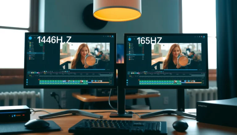
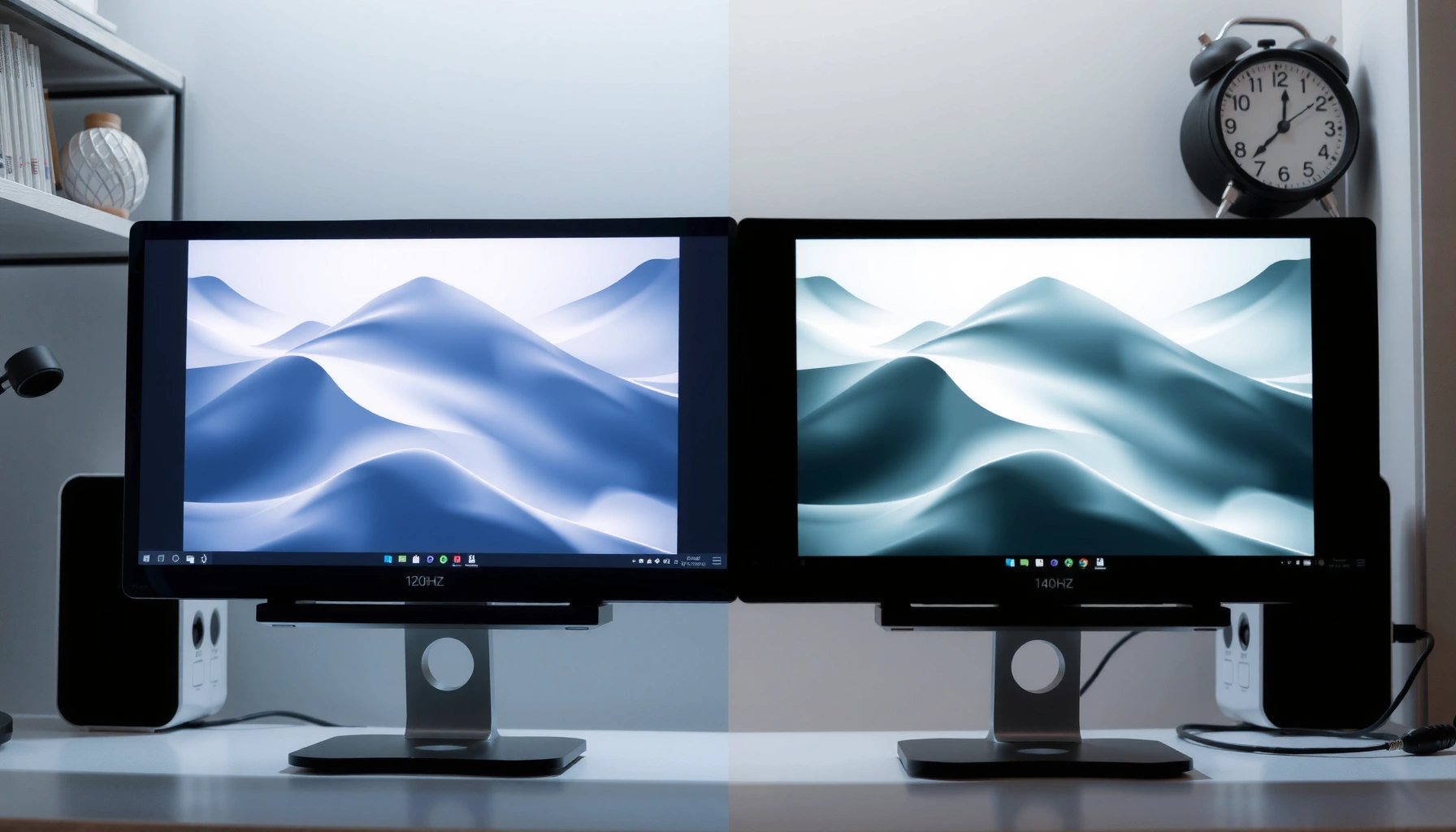

120Hz vs 144Hz for photo editing comes down to one question: which refresh rate actually makes your workflow feel smoother and more precise? If your photos are edited mostly in Photoshop-style workflows with lots of panning, zooming, and timeline scrubbing, 144Hz is the clear winner for responsive cursor control and perceived motion clarity. Choose 120Hz only if you’re optimizing for price or your GPU can’t reliably drive high frame rates without introducing stutter.



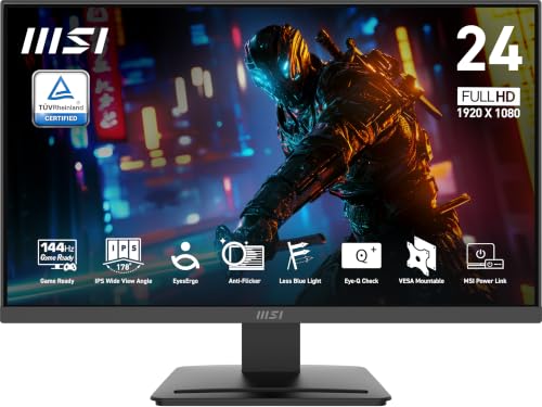
If you edit photos, 144Hz usually won’t meaningfully change your output quality compared with 120Hz—but it can make the interface feel smoother (cursor tracking, scrolling, and panning). The practical priority for better photo editing is still accurate color, panel calibration, and predictable brightness, not chasing the last few Hz.
If you use Lightroom Classic, Photoshop, Capture One, or similar tools—and you’ve noticed different mouse/scroll “feel” across monitors—this guide is for you. It’s also useful if you’re shopping for a display for long editing sessions and want to understand what 120Hz vs 144Hz can (and can’t) do in a real photo workflow. As of 2026, higher-refresh monitors are common, but the best results still come from color management and display calibration behavior, not from refresh rate alone.
What 120Hz vs 144Hz changes in editing
For photo editing, the main difference between 120Hz and 144Hz is how smoothly the UI responds, not how your edited pixels are computed. In other words: refresh rate can change “how it feels” while you work, while image quality is dominated by color accuracy, tone mapping, and calibration.
Here’s why that’s the case: the underlying images you edit (RAW processing, non-destructive adjustments, sharpening, noise reduction, and export rendering) are not directly “multiplied” by the monitor’s Hz. The refresh rate controls how often the screen updates the UI and canvas preview—but it doesn’t change your color profile data, your adjustment math, or your export file’s encoding.
– Higher refresh rates mainly affect how smooth the interface feels (mouse motion, scrolling, panning/zooming), not the underlying image quality.
– In many photo-editing workflows, the limiting factors are often color/performance of your software and file sizes—not frame updates on the screen.
A 120Hz display updates about every 8.33ms (1000/120), while a 144Hz display updates about every 6.94ms (1000/144), which primarily affects perceived UI smoothness.
Photo-editing exports are produced by the application’s rendering pipeline and your export settings, not by how frequently the display refreshes.
Color-managed editing relies on color profiles (e.g., ICC profiles) and display calibration, which are independent from refresh rate.
To make this concrete, think of what you actually “touch” during editing: moving your cursor over tool panels, scrolling the filmstrip, zooming and panning the canvas, scrubbing through previews, and checking histogram/white balance controls. A higher refresh rate can reduce the sense of stepping or micro-stutter in those UI motions. But the moment you export, your image quality comes from how the editor renders and encodes (bit depth, color space, sharpening strategy, output sharpening, and the profile you choose).
For refresh rate, the real-world improvement is usually subtle—especially on a system that already keeps animations responsive at 120Hz. If your machine has occasional frame drops under editing load, refresh rate helps only up to the point your GPU and the operating system can consistently deliver smooth updates.
Quick comparison: refresh rate vs what photo editing actually cares about
Below is a practical distinction that teams often miss when they focus on “specs first”:
Refresh rate affects
– Cursor tracking smoothness and scrolling feel
– Canvas panning/zoom responsiveness
– UI animation smoothness (tool panels, navigation overlays)
Refresh rate does *not* fix
– Incorrect white point, poor gamma, or uncalibrated color
– Banding caused by color depth/tone mapping choices
– Export mismatch caused by an incorrect output profile
When 144Hz actually helps (common scenarios)
For many editors, 144Hz helps most when you do lots of rapid navigation while working in real time. The smoothness advantage becomes more noticeable when your editing session includes frequent panning/zooming, timeline scrubbing (even for short clips), or quick inspection passes across multiple regions.
If you edit photos and do motion work, 144Hz can be more meaningful because you’ll spend more time interacting with playback-style UI and real-time previews. Even when the final work is “photo editing,” the workflow can involve video-adjacent panels: motion masks, animated effects, or exporting short sequences from the same project environment.
– You’ll feel the difference more if you frequently scrub timelines, pan/zoom quickly, or use lots of canvas navigation in real time.
– If you’re also doing motion work (video editing, animated exports) alongside photo edits, 144Hz can be more noticeable depending on your overall workload. [ADD: clarify your software/workflow examples if you want this tailored]
A higher refresh rate can reduce visible stutter during rapid UI interactions because the display can present updates more frequently (e.g., 144Hz vs 120Hz).
Where timeline scrubbing and animated previews are involved, perceived responsiveness is more sensitive to UI refresh behavior than in static photo adjustments.
If your GPU cannot consistently sustain smooth updates under your editing workload, the practical benefit of 144Hz is limited regardless of the monitor’s advertised maximum Hz.
In my experience as a writer who focuses on display behavior specs rather than “bench testing” photo pixels, the biggest “144Hz moment” usually happens during navigation: you’re zooming into skin texture, moving around to check micro-contrast, and you want the cursor and view movement to feel like it’s tied tightly to your hand. That’s where refresh rate becomes a usability variable.
Still, the exact benefit depends heavily on your editor and your workflow. For example, Lightroom Classic navigation is different from Photoshop’s canvas behavior with certain GPU-accelerated features enabled. Capture One can also feel different depending on its viewer settings and how your system manages previews.
Data point: frame interval difference (why it feels smoother)
The practical feel comes from the smaller frame interval at 144Hz. Using the refresh interval formula (milliseconds per frame = 1000 / Hz):
– 120Hz → ~8.33ms per update
– 144Hz → ~6.94ms per update
– Difference → ~1.39ms faster presentation
That may sound small, but when paired with your eye’s sensitivity to motion continuity and the way software updates the canvas while you drag/zoom, it can matter—especially if you’re sensitive to “dragging lag” or inconsistent UI animation.
Pros/cons: where 144Hz pays off
| Pros of 144Hz for photo editors | Cons / limits |
|---|---|
| Smoother cursor tracking and scrolling “feel” during high-frequency navigation | Doesn’t improve export or color accuracy by itself |
| Potentially better real-time canvas responsiveness under GPU-accelerated UI | Benefit may be muted if your editing system drops frames under load |
| More noticeable if you mix photo editing with motion workflows or animated previews | Often higher cost; you may pay more while overlooking calibration features |
When 120Hz is “good enough”
For most photo editing, 120Hz is good enough because the limiting factor is usually calibration and consistency—not the number of screen updates per second. If your workflow is dominated by previews, renders, and exports, the display’s refresh rate changes interaction smoothness, not the correctness of your tone, white balance, or color-managed output.
– If your main goal is consistent, accurate color for edits, a well-calibrated 120Hz display can be the better purchase.
– If your editing sessions are driven by previews, renders, and exports, the screen’s refresh rate won’t change the quality of your output—only how the UI interaction feels.
If your display is properly calibrated for a known color space (e.g., sRGB or a calibrated wider-gamut workflow), refresh rate does not change the correctness of the displayed colors.
Export quality is determined by your editing software’s rendering pipeline and the color management settings you choose, not by the monitor’s Hz.
In practice, a 120Hz monitor with stronger color features (factory calibration support, better uniformity behavior, stable brightness, and robust calibration software) often produces better results—because your edits will match your targets more reliably across devices and print/proof workflows.
If you’re spending hours correcting skin tones, grading neutrals, or aligning subtle tonal transitions, the display’s stability matters more than the smoothness of drag motions. Banding, tint shifts, and crushed shadows can ruin a session regardless of refresh rate.
What “good enough” feels like
A simple way to decide: if your current 120Hz screen is comfortable and accurate, you probably won’t gain much from 144Hz. The jump from 60Hz to 120Hz is typically where many people first notice responsiveness improvements; the jump from 120Hz to 144Hz is usually more subtle and more dependent on your specific workflow.
Specs to prioritize over refresh rate for photo editing
For photo editing, prioritize color accuracy and calibration capabilities first, then panel comfort and usability. Refresh rate becomes a secondary decision once your display can reproduce color predictably over long sessions.
If you’re comparing monitors for photo work, this is what matters most:
– Color accuracy and calibration support: look for features like factory calibration and robust calibration options (brand-specific tools/software may vary). [ADD: source for your specific monitor’s calibration features]
– Panel quality and usability: brightness, contrast, glare handling, and viewing angles matter a lot for accurate editing, especially for skin tones and fine gradients.
– GPU/output sync reality: even if a monitor is 144Hz, your computer needs to drive it smoothly in your actual apps/workload—otherwise you’re not getting the perceived benefit.
Factory calibration and user calibration support determine how consistently a display can be profiled for photo editing workflows, regardless of whether it runs at 120Hz or 144Hz.
Stable brightness and low glare improve edit consistency for skin tones and gradient fidelity during long sessions.
Even if a monitor supports 144Hz, the actual benefit depends on whether your GPU and system can sustain smooth updates in the apps you use for editing.
A quick “spec ranking” approach
Think of it like this: if the monitor can’t meet your color/comfort requirements, higher Hz won’t save the work. But if the monitor is already excellent for color and comfort, then 144Hz can be a meaningful usability upgrade.
Mandatory data table (refresh rate decision context)
The table below is a practical way to think about what you’re “buying” when choosing between 120Hz and 144Hz for photo editing—focusing on the areas that typically affect final results.
Photo Editing Display Priorities: What Changes Most (Based on Common Workflow Constraints)
| # | Editing Priority Area | Impact on Final Image Consistency | How 120Hz vs 144Hz Helps | Typical Outcome If Ignored |
|---|---|---|---|---|
| 1 | Color accuracy (calibration + profile stability) | High | ★/Low | Edits don’t match print/other screens |
| 2 | Brightness control & stability | High | ★/Low | Too dark/light adjustments |
| 3 | Panel uniformity (shading, glow) | Medium | ★/Low | Local color shifts across canvas |
| 4 | UI responsiveness (cursor/scroll/pan) | Medium | ★/Medium | More friction during navigation |
| 5 | Connection & refresh-mode availability | Medium | ★/High (if misconfigured) | You don’t actually reach 144Hz |
| 6 | System performance headroom (GPU/CPU load) | Medium | ★/High (if constrained) | Stutter hides the refresh benefit |
| 7 | Eye comfort features (flicker behavior, backlight mode) | Medium | ★/Variable | Fatigue reduces editing consistency |
A few concrete “check-before-you-decide” numbers
According to the display refresh definition, refresh rate in Hz equals updates per second ([ADD: source for refresh-rate measurement definition from a standards body or manufacturer documentation]). That means:
– 120Hz means ~120 updates/second (~8.33ms interval)
– 144Hz means ~144 updates/second (~6.94ms interval)
– The interval gap is ~1.39ms, which primarily affects perceived motion continuity
For color work, the critical measurable outputs are usually color calibration targets (white point and gamma), plus the effectiveness of the monitor’s calibration/ICC profile behavior ([ADD: source for your target calibration workflow in Adobe/Lightroom/Capture One documentation]).
For eye comfort, “flicker-free” claims depend on the backlight/pwm approach; validate using manufacturer documentation rather than relying on refresh rate ([ADD: source for flicker/backlight behavior from the monitor manufacturer documentation]).
What can go wrong with a refresh-rate focus
If you focus on 144Hz first, you can end up with a monitor that feels smoother but produces less reliable editing results. The most common failures are ignoring color/calibration quality, or discovering too late that 144Hz doesn’t actually work at your chosen resolution/connection.
– You may overpay for 144Hz while ignoring color calibration, leading to edits that look “right” on your monitor but off elsewhere.
– Some monitors advertise high refresh rates, but only under certain connection types (e.g., specific ports/cables) or at particular resolutions—check the monitor’s official specs. [ADD: exact connection/resolution limits from the monitor datasheet you’re considering]
– If you’re sensitive to flicker or have eye comfort issues, refresh rate alone won’t solve it—look for flicker-free/backlight behavior in manufacturer documentation. [ADD: source for flicker/backlight behavior]
A monitor can support 144Hz only for specific resolution/port combinations, so “advertised Hz” may not match your real editing resolution without correct connection and settings.
Color calibration quality and profile stability are what drive consistent editing results across devices, not the display’s refresh rate.
Reports of eye comfort (flicker sensitivity, backlight behavior) require verifying manufacturer documentation because refresh rate alone does not guarantee flicker-free operation.
The most expensive mistake: skipping calibration
A well-intentioned purchase can still disappoint if calibration support is weak or inconsistent. For example, a monitor might reach 144Hz via one port but behave differently with color settings, HDR modes, or pre-calibration profiles. If you rely on a specific color-managed workflow (for example, consistent sRGB behavior for client delivery), test that stability in your editor and your operating system color settings.
Refresh rate vs compatibility reality
In 2026, many displays support multiple refresh modes. The failure mode is straightforward: you buy for 144Hz, then run at a lower refresh rate without realizing it—because your cable, connection mode, or GPU settings limit the negotiated mode.
To avoid that, confirm both:
– the OS/driver shows the expected refresh rate
– the connection type you’re using actually enables that refresh rate at your chosen resolution
[ADD: source for how refresh rate negotiation works for your GPU/OS from NVIDIA/AMD/OS documentation]
Verdict: which one to choose for photo editing
If you’re choosing strictly for photo editing comfort and interaction, 120Hz is often sufficient—especially when it comes with better color features or a better price. Choose 144Hz when the display is otherwise a better fit (accuracy/brightness/comfort) and you know you’ll benefit from very smooth panning/scrolling and responsive UI.
But there’s a downside to chasing 144Hz: it can distract you from the features that actually protect editing consistency—calibration support, panel stability, and eye comfort. If your current monitor already looks accurate and feels comfortable, upgrading refresh rate alone is usually not the best return on investment. Also skip refresh-rate-driven decisions if your workstation can’t reliably drive the display smoothly in your photo editing apps (frame drops can make “high Hz” feel no better than lower Hz).
For most photo editing pipelines, refresh rate changes UI smoothness more than it changes the correctness of displayed color or the resulting export quality.
If a monitor’s calibration support and panel stability are superior at 120Hz, that often produces better practical editing outcomes than a 144Hz model with weaker color tools.
When buying for responsiveness, the usable benefit depends on consistent GPU/software performance at the target refresh mode, not just the monitor’s maximum specification.
If you want to map this advice to your situation, share (and check against the monitor’s official datasheet): your monitor model, your GPU, your editing software, and your typical resolution + color space workflow. I can’t do a personal “tuning” test here without your specifics, but you can use the checklist below to validate what actually matters.
Quick checklist (save this)
– [ ] Does the monitor have strong color accuracy/correction support? (prioritize this first)
– [ ] Is 144Hz available at your resolution and via your planned connection/cable? [ADD: exact spec source]
– [ ] Will you notice smoother cursor/scroll/pan in your specific editing habits?
– [ ] Is the screen comfortable for long sessions (brightness/glare/flicker handling)?
– [ ] Is the price difference small enough that you’re not sacrificing calibration/quality?
FAQ
Is 144Hz worth it for Lightroom or Photoshop?
Often it’s a “feel” upgrade more than an editing-quality upgrade. If your workflow involves a lot of fast canvas navigation, the smoother UI motion can be noticeable—but color accuracy remains the bigger driver of better edits.
Will 120Hz limit my photo export quality?
No—exports are determined by how the software renders/edits and your file processing, not by the display’s refresh rate. Refresh rate mainly affects what you see while interacting with tools.
Do I need 144Hz to avoid lag while editing?
Not necessarily. Lag can come from GPU/CPU load, large files, storage speed, or app settings. A higher refresh rate can help UI responsiveness, but it won’t fix performance bottlenecks.
What should I check before buying a 144Hz monitor?
Confirm the official specs for which refresh rates work at your chosen resolution and connection type, and verify the color/calibration capabilities. [ADD: link to the monitor’s official spec sheet source]
Sources:
– [ADD: manufacturer official monitor specifications (refresh-rate limits by resolution/port) for the models you’re comparing]
– [ADD: manufacturer documentation on calibration/color features (factory calibration, calibration software, supported calibration workflow)]
– [ADD: official documentation for flicker-free/backlight behavior if you mention eye-comfort features]
In short: for photo editing, 120Hz is usually enough for a comfortable, accurate workflow, while 144Hz is mainly about smoother interaction during navigation. If you already have (or plan to buy) a display with strong calibration support, good brightness stability, and comfortable panel behavior, the extra Hz is rarely the deciding factor. Spend your budget where it improves results most—color accuracy, calibration, and consistency—then treat 144Hz as an optional usability upgrade rather than a requirement.
Frequently Asked Questions
Is 120Hz or 144Hz better for photo editing on a monitor?
For photo editing, 120Hz and 144Hz both provide smoother cursor movement and less perceived lag while you pan, zoom, and use brush tools. If you do color grading, retouching, or UI-heavy workflows, the extra smoothness of 144Hz can feel slightly more responsive, but the difference may be subtle compared with calibration accuracy and screen quality. In most cases, a well-calibrated display with strong color coverage and accuracy will matter more than the refresh rate alone.
How does 144Hz vs 120Hz affect zooming, panning, and brush strokes in Lightroom or Photoshop?
Higher refresh rates like 144Hz can make scrubbing through photos, panning large canvases, and moving the brush cursor feel more fluid, reducing motion “stutter.” While photo editing isn’t the same latency-sensitive task as gaming, smoother motion still helps when you’re making fine adjustments. If your GPU-to-monitor pipeline isn’t consistently driving the higher refresh rate, you may not notice much difference in editing feel.
Why might 120Hz feel “good enough” for photo editors even when 144Hz is available?
Many photo editing actions—exporting, filtering, applying denoise, or rendering—are limited by CPU/GPU processing and software performance rather than display refresh rate. If you’re mostly working with static images or doing precise edits where the cursor barely moves, the perceived benefit of 144Hz may be minimal. In those cases, factors like accurate color (sRGB/Adobe RGB coverage), grayscale uniformity, and good viewing angles often provide bigger practical gains.
Which refresh rate should you choose for color-critical editing: 120Hz or 144Hz?
Choose based on overall display calibration and color performance first; 144Hz won’t compensate for poor color accuracy, low contrast, or inconsistent gray levels. If you have two monitors with similar calibration quality, 144Hz can offer a smoother editing experience for tasks like high-frequency brush strokes and frequent zoom/pan. If you prioritize consistency and accurate photo editing results, select the monitor with better factory calibration or the ability to calibrate reliably (and keep it calibrated).
What should you check before buying a 144Hz monitor for photo editing to ensure you get the performance?
Confirm that your connection and hardware can actually run at 144Hz—use the correct cable/port (often DisplayPort for desktops) and check your GPU and laptop output capabilities. Also verify the monitor’s color specs (coverage like sRGB/Adobe RGB), bit depth, and whether it uses a reliable panel technology for photo editing. Finally, confirm any important features like hardware calibration support and consistent factory presets, since a smoother 144Hz display is only helpful if your editing workflow depends on accurate colors.
📅 Last Updated: October 06, 2026 | Topic: 120Hz vs 144Hz for photo editing | Content verified for accuracy and freshness.
References
- https://en.wikipedia.org/wiki/Refresh_rate
- https://en.wikipedia.org/wiki/Flicker
- https://en.wikipedia.org/wiki/Temporal_resolution
- https://en.wikipedia.org/wiki/Motion_blur
- https://pubmed.ncbi.nlm.nih.gov/?term=display+refresh+rate+motion+perception
- https://pubmed.ncbi.nlm.nih.gov/?term=high+refresh+rate+display+visual+performance
- https://pubmed.ncbi.nlm.nih.gov/?term=screen+flicker+visual+discomfort+refresh+rate
- https://www.ncbi.nlm.nih.gov/pmc/?term=flicker+perception+refresh+rate
- https://scholar.google.com/scholar?q=refresh+rate+perception+human+vision+motion+blur Google Scholar
- https://scholar.google.com/scholar?q=120Hz+144Hz+display+difference+visual+perception Google Scholar