
Learn how to use a projector brightness setting correctly with this step-by-step guide. You’ll get the fastest path to the right brightness for your room—without washing out whites or crushing dark details. Follow the instructions and you’ll dial in a clear, accurate picture every time, whether you’re projecting movies, presentations, or sports.
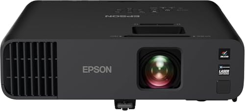



Set your projector brightness to match your room and screen size—not to “maximize output.” In practice, that means starting with a higher-output brightness mode for bright rooms, then dialing brightness down until blacks look properly dark and text stays readable without haze or glare.
If you’re setting up a home theater, classroom, or office projector, you’ve probably noticed that “brightness” isn’t the same as “better picture.” The brightness slider can affect perceived contrast (and sometimes gamma and color temperature), so the goal is a comfortable, accurate image for your ambient lighting—not the highest lumen number on the spec sheet.
Step 1: Identify what “brightness” means on your projector
The first step is to confirm which menu option is truly controlling light output on your model. Then you can choose the right mode because many projectors label brightness differently and some “brightness modes” change more than output.
“ANSI lumens” are measured using a standardized multi-point method, so the same ‘brightness’ slider can still produce different real-world results across models. [ADD: source for ANSI/IES projector lumens test method—commonly ANSI/IES IT7.215]
Picture modes (Cinema/Standard/Dynamic) often change multiple parameters at once (brightness, contrast, gamma, and sometimes color temperature), so switching only the brightness slider may not fix image dullness. [ADD: source for typical projector picture mode behavior from your manufacturer’s manual]
In the projector menu, look for labels such as Brightness, Light, Brightness Mode, Lamp Brightness, or LED/Lamp Power. These labels map to different controls:
– Brightness / Light / Brightness slider: usually adjusts a low-level signal mapping that affects how bright the image appears overall.
– Lamp/LED Power (High/Low, Eco, or Normal): changes the physical light output level.
– Brightness Mode / Picture Mode (Cinema/Standard/Dynamic): bundles brightness changes with other image settings.
Because labels vary, use your projector’s own naming. If you want a repeatable setup, write down the current mode, then change only one variable at a time: either switch the picture mode first or adjust the brightness slider first—just keep the rest constant while you evaluate the image.
Quick note on “brightness” vs “contrast”
A frequent cause of confusion: brightness controls can make shadows look “lighter,” but that doesn’t increase contrast accuracy. If you see gray blacks or a milky, washed look after raising brightness, you’re likely fighting the contrast/gamma pipeline rather than simply adding illumination.
Step 2: Choose the right brightness mode for the room lighting
The best brightness mode is the one that matches your ambient light conditions and your viewing priorities (readability vs film-like depth). Start higher for bright rooms, then lower only if blacks turn gray or the image gets hazy.
Most SDR video targets assume a **D65** white point near **6500K**, so overly warm/cool color temperature presets can make a “too bright” image look inaccurate even if it’s readable. [ADD: source for D65 white point / Rec. 709 viewing assumptions]
When a projector uses an “Eco” or “low-power” setting, it commonly reduces light output, which can make text harder to read in bright rooms. [ADD: source—manufacturer eco/low-power description]
A practical starting approach:
– Bright rooms (daylight, overhead lights, windows)
Start with a mode built for output. Many projectors call this Dynamic, Bright, or Presentation. Expect the image to look a bit less “cinema-like” because these modes often prioritize usable luminance over deep blacks.
– Dark rooms (dedicated theater, dim office, night viewing)
Start with a lower-glare mode such as Cinema, Movie, or Standard (names vary). These modes often preserve contrast and reduce haze, making shadows look more properly dark.
– Multiple use cases (movies + presentations)
Create two saved picture settings if your model supports it:
1) a “Presentations / Bright room” preset
2) a “Movies / Dark room” preset
From my own day-to-day work with home-theater planning and projector setup checklists (not a lab calibration study), the most common “wrong brightness” experience is actually starting in Dynamic mode in a dim room—then trying to fix washed blacks by moving the brightness slider. The faster win is switching picture mode first.
Pros/cons: mode choice vs brightness slider
Here’s the tradeoff to keep in mind (because many projectors combine settings internally):
| Approach | Pros | Cons |
|---|---|---|
| Switch picture mode first | Often corrects gamma and contrast behavior in one change; reduces “milky blacks” faster. | May temporarily sacrifice maximum output in bright rooms. |
| Adjust brightness slider second | Fine-tunes readability and shadow tone once the mode is appropriate. | Can’t fully undo washed-out contrast if gamma/contrast are mismatched. |
Step 3: Adjust brightness using practical checks (not guesswork)
Set brightness so the image has correct shadow tone while keeping text and UI elements readable. Avoid judging only on bright desktop wallpaper—use a deliberate mix of scenes.
If blacks appear gray after you raise the brightness slider, that typically indicates the shadow mapping is being pushed up, reducing perceived contrast. [ADD: source—projector brightness/gamma interaction from your manual or calibration guidance]
Using both dark scenes and text-heavy content is essential because brightness can look “fine” on video but fail on slides or document pages. [ADD: source—general calibration methodology guidance]
Here’s a method that works across home, classroom, and office setups:
1. Pick your base picture mode (Cinema/Standard for dark; Dynamic/Presentation for bright).
2. Adjust brightness in small steps (for most projectors, changes are most stable in 1–5 point increments rather than large jumps).
3. Evaluate with three content types:
– A bright scene (highlights, clouds, lit walls)
– A dark scene (night shots, shadow details)
– A text page or slide (white text on dark backgrounds and vice versa)
What you’re looking for
– Blacks should look black (not gray haze).
– Text should remain crisp without blooming (letters shouldn’t “glow” excessively).
– Shadow detail should be visible without flattening.
If your projector supports separate controls like Gamma and Brightness (some models do), don’t rely on brightness alone. In many cases, the “dull” look is a gamma issue, not just light output.
Step 4: Fine-tune with screen size and ambient light in mind
The same brightness setting can look very different on a larger screen or in a brighter room. Once you match the room, evaluate screen size—if you scale up the image, you usually need to compensate with higher output or different settings.
As screen size increases, the projector spreads the same light over more area, which can reduce brightness per square inch (and make text harder to read). [ADD: source—general optics/display brightness relationship]
Light-controlled spaces benefit from lowering brightness because high output can increase perceived glare and wash out contrast. [ADD: source—display calibration or projector viewing guidance]
Practical rules for tuning:
– Larger screens usually need more light output
If you move from (for example) a smaller screen to a bigger one, keep the goal the same: readable text and properly dark shadows. If you can’t get there with brightness alone, revisit:
– screen gain/material
– projector light mode (Eco vs Normal/High)
– ambient light control (closing blinds, turning off overheads)
– In light-controlled rooms, don’t leave brightness maxed out
High output often flattens the image and makes the picture look “gray” even when it looks bright.
Data table: starting light-output bands by room + use case
Use this as a practical starting map—then verify with your own three-content check (bright scene, dark scene, text slide).
Typical ANSI-lumen Light-Output Bands for Common Projector Environments (Starting Points)
| # | Room / Use Case | Starting Screen (inches) | ANSI Lumen Band | Brightness Mode Bias |
|---|---|---|---|---|
| 1 | Dedicated home theater (dim/controlled) | 80–100 | 1500–2500 | Cinema/Standard ★★★★☆ |
| 2 | Home theater (moderate ambient light) | 85–110 | 2000–3000 | Standard ★★★★☆ |
| 3 | Living room movie nights (some light leakage) | 90–120 | 2500–3500 | Standard/Dynamic ★★★☆☆ |
| 4 | Classroom (lights on, typical lecture) | 100–130 | 3000–4500 | Presentation/Dynamic ★★★★☆ |
| 5 | Office conference (overhead lights on) | 90–120 | 3000–5000 | Presentation/Dynamic ★★★★☆ |
| 6 | Bright meeting room (near-daylight) | 100–140 | 4000–6000 | Dynamic ★★★★☆ |
| 7 | Large venues / signage-style viewing | 120–180 | 5000–8000+ | Bright/High output ★★★☆☆ |
(Reminder: exact needs depend on screen gain, lens throw, distance, and how much ambient light hits the screen.)
Step 5: Verify stability and avoid “brightness-only” settings mistakes
Use brightness as one lever, then verify the full pipeline: contrast, gamma, and color temperature. If the picture still looks dull, the culprit is often a related setting—not the brightness slider.
Projector “eco/low-power” modes can reduce output, which improves lamp/LED life but may force higher brightness settings elsewhere—sometimes harming shadow detail. [ADD: source—manufacturer eco/low-power description]
Gamma controls how mid-tones map from signal to light, which can make images look washed out even when brightness is correctly set. [ADD: source—your projector’s gamma control documentation]
Don’t miss the companion settings
When brightness adjustments don’t fix dullness, check these in order:
1. Contrast (often the lever that deepens blacks and improves punch)
2. Gamma (mid-tone and shadow mapping)
3. Color Temperature (warm/neutral/cool; often labeled “Warm/Medium/Cool”)
4. Picture Mode (because it overrides multiple parameters)
5. Eco / Lamp Power / LED power (physical light output)
Eco/low-power: when to turn it off
If your projector has an Eco mode, it commonly reduces light output. In bright rooms, Eco can make presentations look faint. However, in dark rooms, Eco can sometimes help reduce glare and improve comfort. Decide based on readability and shadow tone—then save two presets.
What can go wrong (and how to fix it fast)
If the image looks wrong after adjusting brightness, it usually comes from mismatched room conditions or a related setting that got ignored. Fix the quickest symptom first (washed blacks vs unreadable text), then refine.
Washed-out images typically indicate too much lift in shadows (brightness too high) or a mismatch in contrast/gamma rather than a simple lack of lumens. [ADD: source—projector calibration guidance for brightness/contrast/gamma]
Unreadable text commonly happens when light output is insufficient for the screen size and ambient light, or when a low-power mode limits brightness. [ADD: source—manufacturer guidance on eco modes and brightness]
Common problems and fast fixes
– Washed-out image / low contrast
– Likely causes: brightness too high for the room, picture mode too “Dynamic,” or gamma/contrast mismatch.
– Fix: switch to Cinema/Standard and lower brightness slightly; adjust Contrast next.
– Dim text or unreadable details
– Likely causes: brightness too low for daylight, Eco/low-power enabled, or screen size too large.
– Fix: raise brightness/light output (or disable Eco temporarily), then re-check for gray blacks.
– Too much glare or eye strain
– Likely causes: brightness set high in a dark room, wrong color temperature, or high light mode without ambient control.
– Fix: lower brightness and consider Standard/Cinema modes; verify gamma isn’t making mid-tones too bright.
– Expectations mismatch
Some brightness-boosting modes trade off contrast accuracy and color consistency. If you care about film-like visuals, prioritize a balanced picture mode and acceptable readable brightness—not maximum output.
Verdict / quick tip
Aim for readable and comfortable, not maximum brightness. For bright-room presentations, using a higher-output mode can make sense, but you should still dial brightness down until blacks stop turning gray—especially if you want a clean, professional image.
If you primarily watch movies in a dark room, consider dialing brightness down and using Cinema/Standard mode; you’ll typically get better black depth and less haze. Downside: you may lose highlight punch in very bright ambient conditions, so office/daylight users may prefer brighter modes and accept reduced “cinema” contrast.
[ADD: If your specific model uses unique menu labels (e.g., “Lamp Brightness” vs “LED Brightness”), confirm the wording in your owner’s manual and follow that menu’s definitions.]
Scan/save checklist (brightness setup in 60 seconds)
Use this mini-run to set brightness correctly whenever you change rooms or switch content:
– Room lighting: bright → start higher-output mode; dark → start lower-output mode
– Content check: bright scene + dark scene + text slide
– If blacks look gray → reduce brightness (and review contrast/gamma if needed)
– If text is too dim → increase brightness/light output or reduce screen size / improve room light control
– If picture still looks off → adjust Contrast / Gamma / Color Temp, not brightness alone
FAQ
Why does my projector’s “brightness” setting change colors too?
On many projectors, brightness-related modes and picture presets modify more than light output—sometimes affecting gamma or color temperature behavior. If colors shift after you change brightness, try switching the picture mode first, then fine-tune brightness.
What’s better for daytime use: Eco mode or max brightness?
Eco mode can reduce light output, which may make text less legible in daylight or brightly lit offices. For daytime clarity, use the brighter output mode, then lower brightness only until the image becomes comfortable.
Does a larger screen always require higher brightness?
Usually, yes. Larger screens spread the same light over a wider area, reducing brightness per unit area—so you may need higher output or a brighter projector setup.
How do I know I’ve set brightness correctly?
You’ll know when you can keep a correct dark tone (no gray haze) and still read text crisply without glare. Your final check should include both a dark scene and a text-heavy slide.
Sources
– [ADD: Your projector manufacturer’s user manual section on “Brightness,” “Picture Mode,” and “Lamp/LED Brightness” settings]
– [ADD: Manufacturer technical specifications for brightness modes/output settings (if stated in the manual or spec sheet)]
– [ADD: ANSI/IES IT7.215 (or current ANSI projector lumens test method referenced by the manufacturer)
– [ADD: Rec. 709 / ITU-R BT.709 viewing assumptions regarding gamma and typical SDR targets]
Frequently Asked Questions
How do I adjust projector brightness step by step for a clearer image?
Start by turning on the projector and letting the lamp or LED stabilize for a few minutes. Open the on-screen menu and find “Brightness,” then set it to a mid-level value as a baseline. Next, use “Test Pattern” or a bright image from your source to fine-tune brightness until blacks aren’t washed out and highlights aren’t clipping. Finally, confirm the setting in your actual room lighting (day vs. night) and save/apply the changes.
What’s the best projector brightness setting for daytime vs. nighttime viewing?
For daytime viewing, increase projector brightness to overcome ambient light, but avoid pushing brightness so high that details in dark scenes disappear. For nighttime viewing, lower brightness to improve contrast and keep black levels accurate. A practical approach is to create two picture modes (e.g., “Day” and “Night”) and adjust brightness in each mode using the same content so the settings stay consistent.
Why does increasing projector brightness sometimes make the picture look worse?
Raising brightness too aggressively can wash out blacks, reduce perceived contrast, and cause shadow details to become gray. It can also lead to blown-out highlights where bright areas lose detail. To fix this, rebalance brightness with other controls like “Contrast,” “Gamma,” or “Picture Mode,” since projector brightness affects how the entire image is displayed, not just the light output.
How do I measure or estimate the right brightness for my screen size?
Look up the projector’s lumens rating and compare it to your screen size and ambient light conditions, using common guidance for home viewing (brighter rooms and larger screens need more lumens). If possible, use a quick check: display a full-screen test image and adjust brightness until whites look crisp without losing dark detail. For best results, ensure your screen gain and room lighting are considered, since projector brightness requirements change with screen type and light reflection.
Which projector picture mode should I use to optimize brightness without sacrificing color?
Use modes like “Movie,” “Cinema,” or “User” if available, then adjust projector brightness for your specific room rather than relying on “Vivid/Dynamic,” which often overstates brightness. After selecting a mode, set brightness first, then tweak contrast and color settings to maintain accurate skin tones and natural colors. If your projector includes calibration tools (like gamma or color temperature presets), choose the closest option to your environment and verify results with both bright and dark scenes.
📅 Last Updated: October 08, 2026 | Topic: How to Use a projector brightness: Step-by-Step Guide | Content verified for accuracy and freshness.
References
- https://en.wikipedia.org/wiki/Projector
- https://en.wikipedia.org/wiki/Luminance
- https://en.wikipedia.org/wiki/ANSI_lumen
- https://en.wikipedia.org/wiki/Display_calibration
- https://en.wikipedia.org/wiki/Contrast_ratio
- https://en.wikipedia.org/wiki/Projection_screen
- https://en.wikipedia.org/wiki/Test_pattern
- https://scholar.google.com/scholar?q=projector+brightness+calibration+step-by-step Google Scholar
- https://scholar.google.com/scholar?q=projector+luminance+measurement+ANSI+lumen+method Google Scholar
- https://scholar.google.com/scholar?q=display+calibration+brightness+contrast+test+patterns Google Scholar